
In 2011, more and more web traffic is mobile, being driven by the increased technologies in cell phone bandwidth (3G and 4G) as well as the increased adoption of smartphones, including the iPhone, Android-based phones and Blackberries. Optimizing a website for the smaller screen size while also taking into consideration the concept of a touch-based navigation of a website versus the original mouse-based navigation demands taking an entirely new approach to a website's mobile design. Bigger fonts and large, clickable screen areas merged with an aesthetic interface are the name of the game now.
The California Gay & Lesbian Chamber of Commerce's mobile website takes advantage of these concepts, automatically sensing whether the user is viewing the site from a PC, a Mac, a smartphone or a tablet and taking the user to that optimized web page. Since the tablet experience is more similar to a smartphone than a laptop, with simply a larger screen, the same touch-based navigation was maintained while being optimized with larger images and more detailed information being made to flow across the screen.
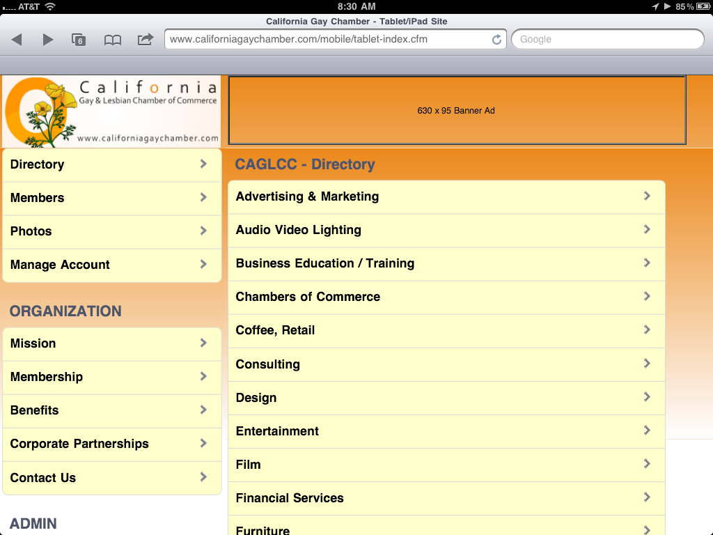
Keeping in mind that online users, both on their phones and on their computers, demand quick access to information helps to determine the functionality of these new sites. If a user is looking for a business directory listing, that user needs to find that information quickly and easily. List menus work great when they can provide fast access to that information, and search pages fill in where a more detailed entry needs to be searched for. These rules were also used when building the navigation of the California Gay & Lesbian Chamber of Commerce's mobile website, providing quick and easy access to the membership directory, highlighting featured members, as well as ensuring fast access to chamber information, membership benefits and corporate partnership opportunities.

Viewing a member's business profile has been optimized for the smartphone screen, and links to a member's Facebook and Twitter profiles take the user to the mobile-optimized versions of these sites as well. Clicking on a member's business address automatically takes the user to the smartphone's built-in mapping program for quick access to locating the business and finding directions. Clicking on a member's business phone number automatically brings up the dial pad of the phone, and on an iPad, brings up a menu allowing for the member to be added to the iPad's contact database (since iPads are not phones).

No comments:
Post a Comment